Unsolved HCI Part 2: The Design

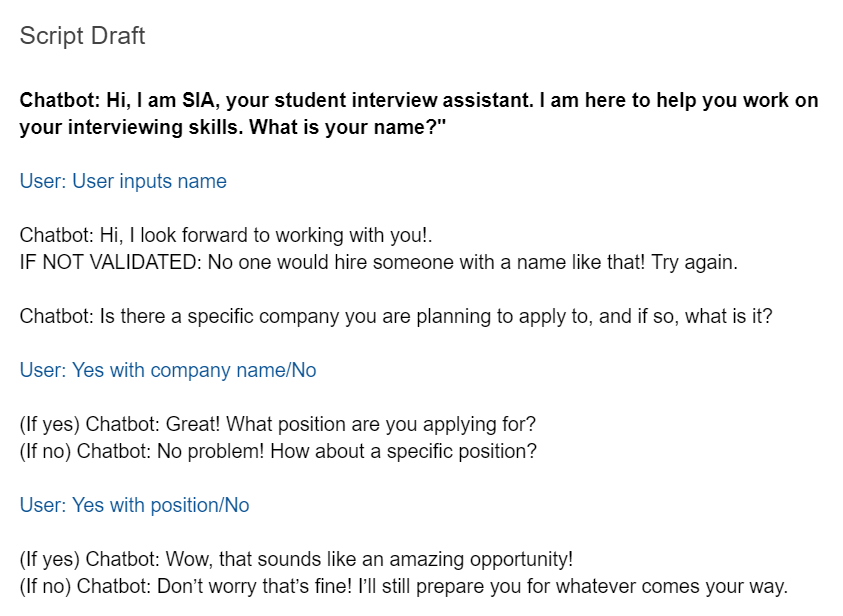
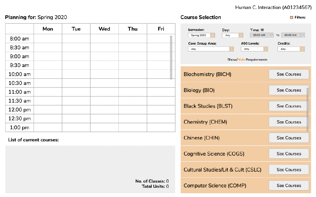
In my post “Unsolved HCI: Online Teaching“, I discussed the issue of online learning and digital classrooms and how the ongoing COVID-19 pandemic has raised the demand of efficient virtual learning environments. For this present project, I continued to work with Perrin and Daniel in designing an online learning platform aimed at increasing engagement as well as facilitating discussions.

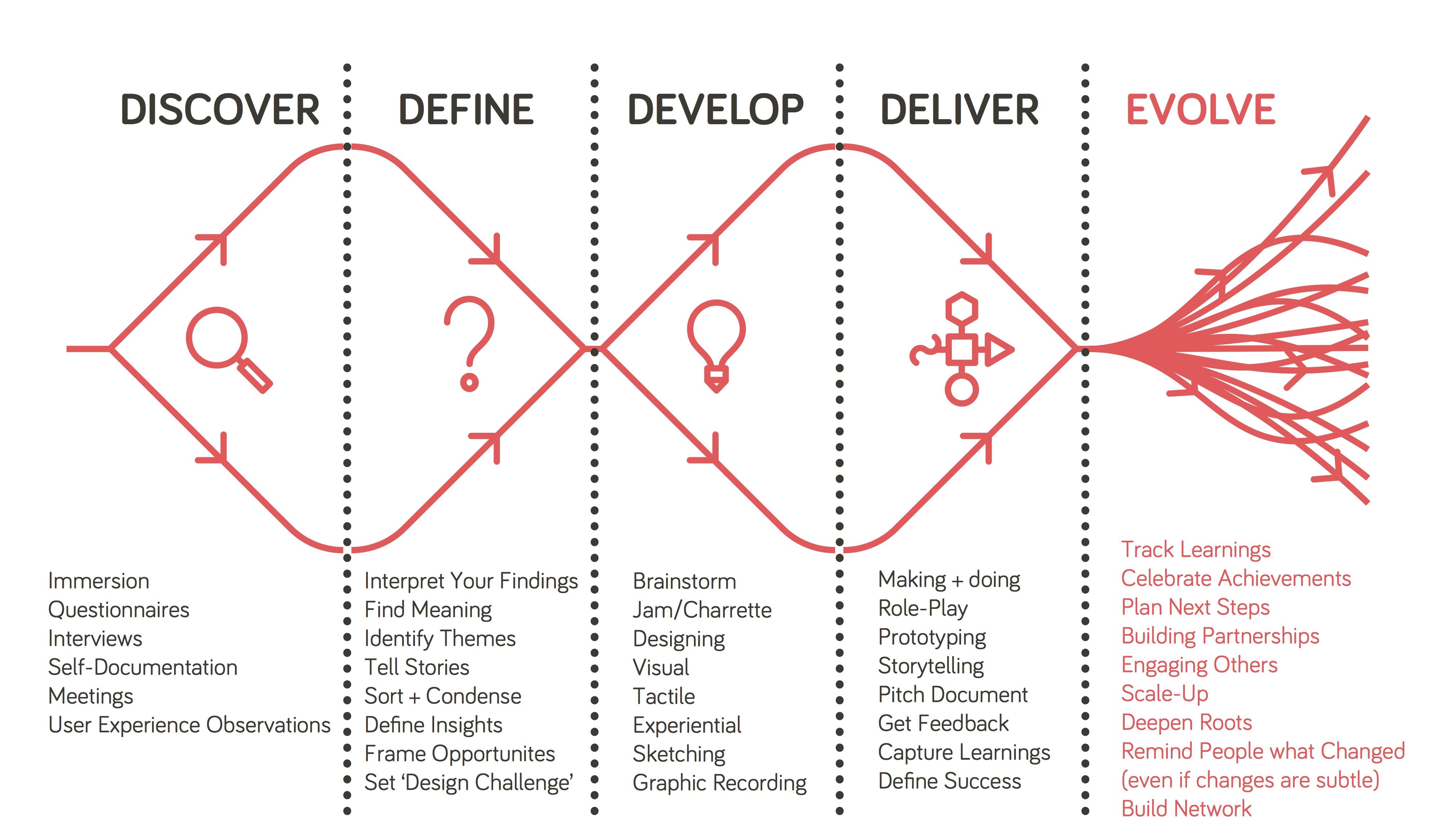
Reorganizing and Redefining Our Problem.

In an intermediate meeting, we used the time to refocus our ideas and begin formulating in our heads what kinds of aspects we wanted our design to have and, overall, what kind of system we wanted our design to be. We had established previously that our main concerns included a students’ ability and motivation to participate in synchronous lectures/discussions. A specific issue brought up by our HCI professor was the lack immediate sharing of information, or lack of information sharing at all. In our current YouTube/Slack setup, it was difficult to not only appoint a representative for our smaller groups, but also just difficult in general to get people to say anything in the YouTube chat. So, we needed to consider how we might incentivize students to participate and how we might remove any barriers that are keeping students from participating further.

One reason for this decrease in participation, particularly apparent in a smaller class like our HCI class, may have been the lack of a sense of community and communication. Because such rapid progression of the pandemic, teachers and professors were subject to pressure to quickly develop an online learning system that would work for their class. Given the sudden disruption in our normal classroom environment, it seems likely that many would have, even unbeknownst to themselves, been impacted by the loss of such connections and shifts in the social dynamics built throughout the first half of the semester, thus losing motivation to interact.

In their paper “Classroom Community and Student Engagement in Online Courses”, Young and Bruce suggest that a stronger sense of community and engagement can be built through increased social interactions and collaborative learning. Yet, behind a computer where the only means of communication is through typed messages, the social aspect lacks comparatively to a physical classroom setting. Even with audio/video calls, where one is able to see and hear all of their peers, those whose resources do not allow for effective calls, such as not having a large enough bandwidth, may end up feeling a sense of isolation and detachment as their learning experience falls behind those of other students. As such, our basic motivations behind this project were to try and find a balance between human interaction and technological limitations.

Solution: Video Games…?

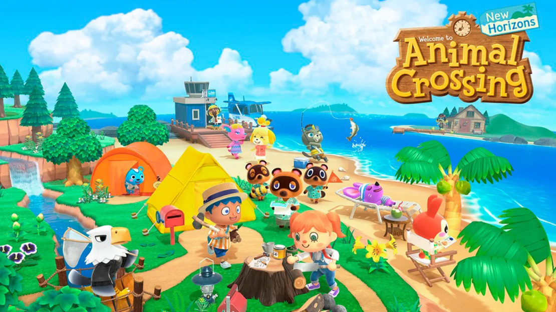
While many have been struggling to find their place in this pandemic, one particular item, a video game, seemed to find its glory in this pandemic – Animal Crossing: New Horizons. An endearing life simulation video game, Animal Crossing allows players to dwell in a fictional world surrounded by animals allowing one to escape the real world while still maintaining social interactions with other players. I remember one of my friends mentioning that people were lovingly deeming this new wave the “at-home version of Pokémon Go summer”.

Animal Crossing: New Horizons

Seeing the success of such a platform, one idea brought up was to consider using video games, and particularly such life simulation games as well as RPGs, as references and looking into how such games are able to build an online community, both directly and indirectly.

The Design Plan.

Starting with what initially started as a casual suggestion, eventually, we landed on the idea of creating a 3D virtual classroom environment where each student would have their own avatar representing themselves. When this idea was first brought up, I was a bit skeptical. My initial reaction was that such an interface could potentially be more distracting than engaging, especially since my mindset was so focused on the idea that this interface would be inspired by video games and, consequently, turn out like one and/or be treated like one. However, after considering our user needs, I became content with the idea that with the right implementation, such an interface might actually be useful.

In an article by Gratch, et al., they compare the interactions between virtual characters to the interactions of people from face-to-face communication and found that virtual humans can be just as, if not more, engaging as real ones through the use of listening feedback and perceivable reactions. This was one thing we had noticed was missing in many learning systems that forewent the use of video and audio. Thus, the hope would be that by introducing avatars and allowing the avatars some more social features, the sense of interaction and collaboration would increase without the need for video and audio.

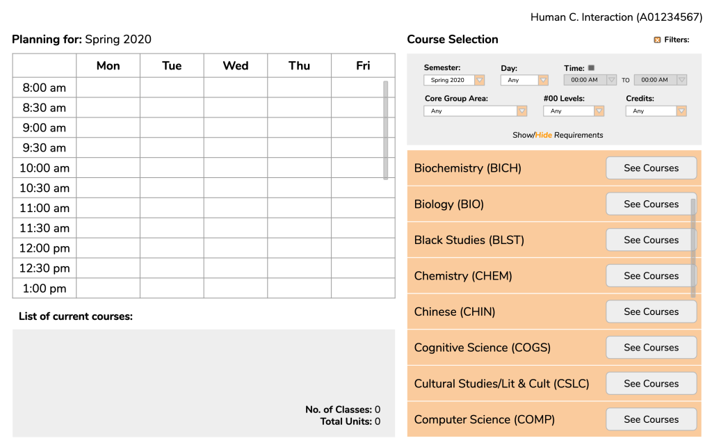
We had to recognize several factors and potential constraints that would influence our design. For example, lectures with 20-30 participants will obviously have different needs from lectures with 100+ participants. Furthermore, even one class might utilize different lecture structures on different days. Some days might be more lecture heavy and other more discussion heavy. To acknowledge these discrepancies, for our user group, we decided to follow our idea presented in my previous blog post on focusing on smaller class sizes. As for class structure, we hoped to create a design that would be cater toward both lectures and discussions.

Basic Sketches.

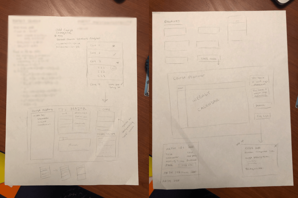
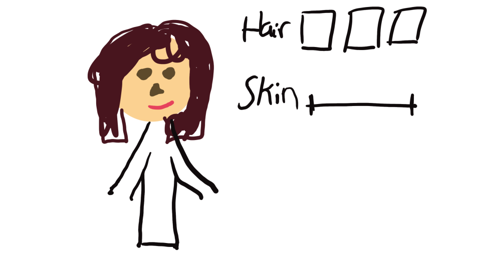
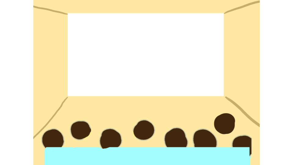
We started with some sketches that would guide both the flow of our design as well as perhaps help us narrow down what part of this design plan that we wanted to focus on. One initial page was a page in which students would be able to customize their avatar and another page was the actual 3D classroom itself. In the sketch of the classroom, the white blank space represented the slides, the dark shapes the avatars, and the blue box a potential bar with reactions, settings, and other features.

Basic sketch of avatar customization page.
Basic sketch of 3D virtual classroom.

We also created wireframes of pages that represented the navigation between pages that would eventually get the student to their desired classroom.

Different pages to navigate through system.

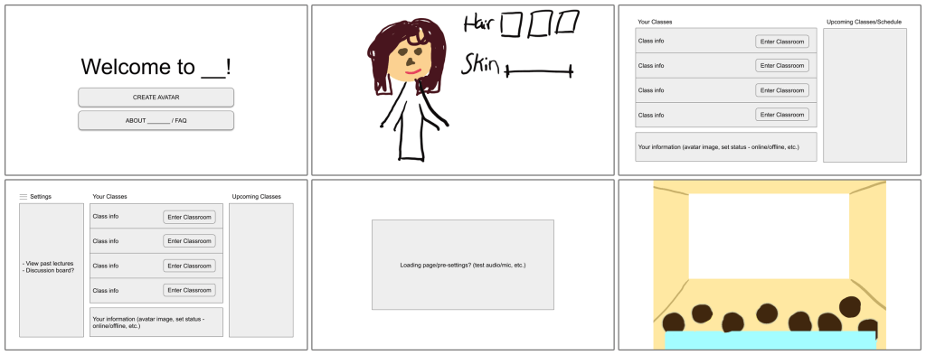
However, as we started to develop the design and consider what features we should include to the classroom, we soon realized that just the virtual classroom itself would already be a lot to work on. So, we shifted our focus to just the classroom with the underlying assumption that a student would have already created their avatars.

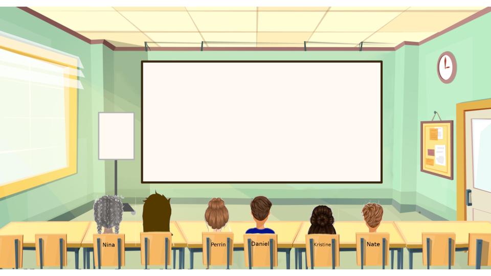
Here is the next, more detailed iteration of the previous classroom design that Perrin created:

Next iteration of 3D virtual classroom.

Adding Features and User Testing.

After setting up the main 3D classroom design, we began to add features to the design that we believed would enhance the experience of the user. In prior discussions and interviews, several students had expressed their desire of having the option to use audio. However, others recognized that sometimes quick comments, especially during a lecture, might be better made through a typed chat instead. So, we decided to include both the option of audio and a chat on the side to accommodate for different potential situations. There is also a group tab for the chat in the case that smaller discussion groups are made.

Audio Feature.
Switching between main chat and group.

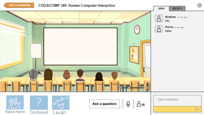
Another feature that we hoped would push forward our goal of increasing social cues was adding reactions that an avatar could express. These reactions, though quick, would ideally simulate the human interaction of responding and giving feedback to certain comments through non-verbal means. Next to these reactions is a button that allows students to ask questions separate from the messages in the chat. This was added with the idea that perhaps some questions would call for an immediate answer from the professor that might be missed in the chat.

Different reactions available.

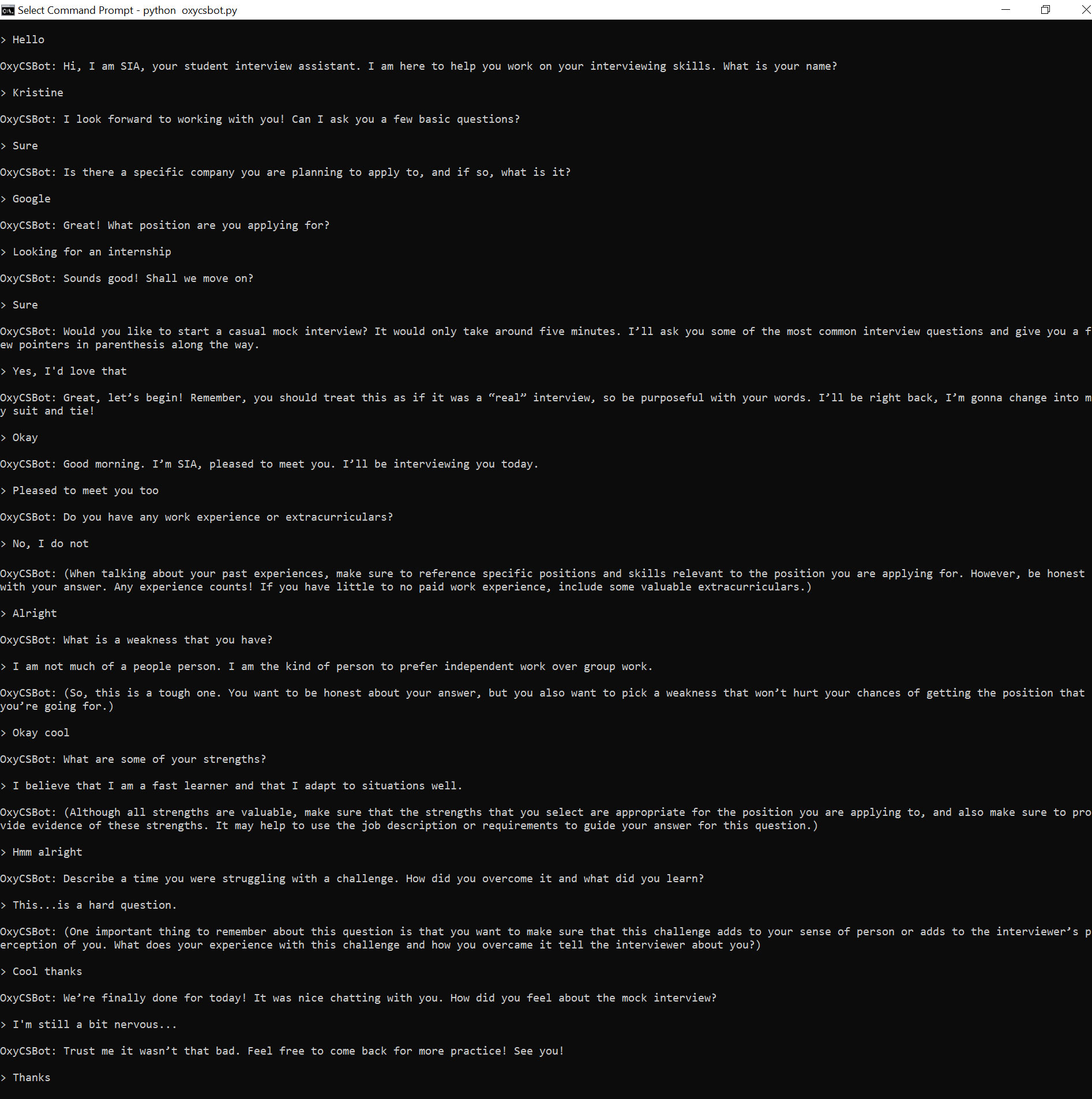
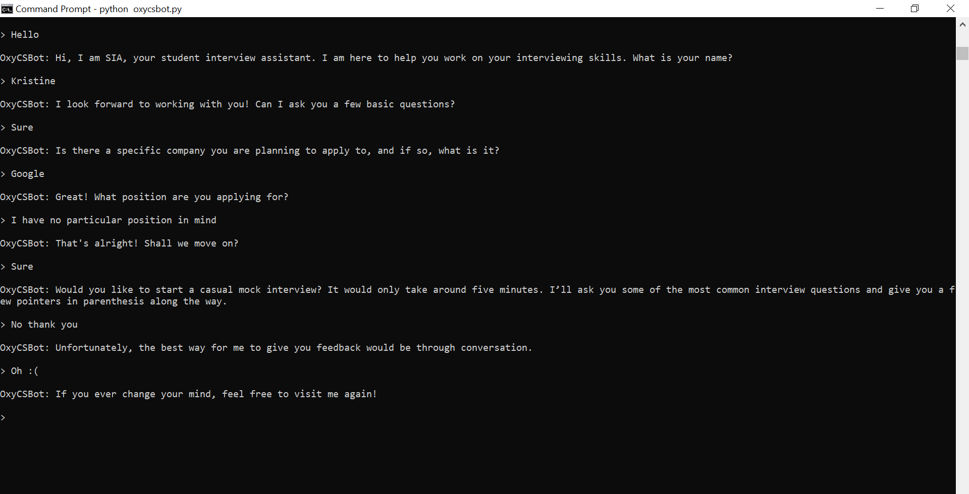
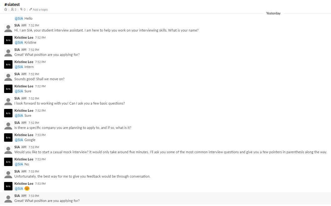
At this point, we decided it would be good to conduct user testing with the iteration we had now to see what aspects might need to be modified. With user testing, we realized a couple of things. First, we recognized that we would not be able to test how our design would impact online learning in the long-run due to time. Additionally, since we would not actually be simulating a class session, we would not be able to test whether this design would be effective with multiple students participating at once. Thus, our goal with user testing turned into observing how an individual would engage and interact with the interface and later interviewing users on their thoughts on this kind of system of online learning.

There were some mixed feelings about the system. Overall, users did not seem to have much of a problem navigating the design and one instructor who tested the design even commented that he thought the platform would be easier for students who are tech impaired to use. However, some of our users did raise concern over some of the aspects of the system.

The same instructor worried that even with more apparent visual cues of reactions and questions, he would sometimes miss them since he writes out his lectures as he goes. So, he suggested that such a feature might even be coupled with audio feedback. Though we could not show visually show this in our final design, we did agree that this point could be beneficial so long as the audio feedback is not distracting as well.

Another concern was from a student who wondered whether the space for the slides themselves would be too small and said that they would prefer to see the slides full screen. It is with this feedback that we decided to add in the feature to zoom in and out the view of the classroom, also present in the images above, so that one could work with their preference. In the zoomed in version, avatars would instead show up on the bottom as icons.

Conclusions.

Unfortunately, we were unable to get a working prototype, or even something close to one, and admittedly our design is far from being perfect. When I shared this idea with a friend, she stated that we would have to be “very, very careful and intentional in setting up the aesthetic of the program” to prevent students from treating this system lightly and casually. Even now, I recognize that without proper long-term user testing, it is difficult to know whether our design would really be effective or not, both on an individual level and a class level.

However, I would still say that through this project we were definitely able to understand better what students miss and desire from the classroom experience, and perhaps this knowledge will help us improve our experiences of online learning in the future should it be necessary.

Design is.

“Good design” is difficult to define. Many factors can determine what makes a design good and, inevitably, good design is subjective. However, from reading about design, learning about design, and designing myself, I established a couple of points on how I understand good design.

Design should (not) be intuitive.

From the perspective of a user, good design is intuitive. Good design should be clear, both in what a user can and cannot do. However, intuition is not static. Familiarity with many common actions and allowances continues to grow and change over years of using certain products. Thus, intuitiveness should not keep designers from also being innovative and creative.

That all being said, from the perspective of a designer, intuition may not be so advantageous. User testing, I realized from my own experience, is so important because often times users would need to clarify certain aspects of the design that I hadn’t considered to be confusing. Designers must be careful that, when creating an interface, they do not apply and implement features that make sense to themselves but lose the user as they interact with the design.

Design should be comfortable.

This point ties in with the previous point on intuition but, here, comfortable covers a broader scope: easy to navigate, void of unnecessary distractions, pleasing to the senses and the mind, etc. Sometimes the smallest inconveniences can make a huge difference as to whether a user enjoyably interacts with a design.

Admittedly, I find this more difficult to consider than expected as everyone’s level and standards of comfort varies. For example, in Murnane et al.’s paper on their design process of the fitness app WhoIsZuki, they mentioned that some users enjoyed the notifications for reminders and updates from the app while others found the notifications intrusive and distracting. A feature like this might be balanced by allowing settings and preferences, but a designer must also be careful that these preferences do not defeating the purpose of the design altogether (helping the user to exercise regularly).

Design should be functional and helpful.

Every design has a function, a purpose to achieve, and at the end of the day, the most important question when it comes to design really is…does it work? Does the design do its job? And, on top of being functional, does this design actually help? Does this design produce more benefits as opposed to detriments?

Good design does not always have to provide some grand or revolutionary usage. In fact, from my experiencing designing for projects in my HCI class, I found that designing for a more focused group of goals and users is so much easier. As users, people search for and gravitate toward products that they believe will in some way positively impact their lives and, well, a design cannot positively impact users if it does not work to begin with.

At the end of the day…

Design cannot be perfect. In fact, I actually think that a world with perfect design, whatever that would be, would be pretty boring. The world of new and innovative design is exciting, and with perfect design, that world would not exist.

Unsolved HCI: Online Teaching

We live our lives surrounded by all kinds of technology from fundamentals such as computers and phones to novelties such as smart watches and AI assistants. Like a cycle, we constantly develop new technology to support our lifestyles and we naturally modify our lifestyles to integrate this technology.

However, although improvements are constantly being made, problems with technology, perhaps at even the most basic levels, never cease to exist. The “paper cuts of today’s technology” as described in our project prompt. Furthermore, especially as we form a routine of using such technology, many of these issues, even the most obvious ones, may go unnoticed and unsolved until someone really sits down to consider them.

The prompt of the current project I am working on is to propose a solution to an unsolved problem in HCI, and this first blog post is to focus on the “first diamond” of the Double Diamond Model, describing the problem we are solving and defining the appropriate user needs.

Though we considered other ideas such as cyber security, technology and motivation, and the ideology bubble of social media, my group members, Perrin and Daniel, and I ultimately decided to tackle a problem that has, unexpectedly, recently become incredibly relevant, the problem of online teaching and the digital classroom, focusing on the aspect of class discussions, and what elements of discussions we think would be best to improve.

The Move From Physical to Digital.

Recently, due to the growing COVID-19 pandemic, classes taught in institutions have been forced to move online. With limited time to prepare, teachers and professors needed to quickly figure out methods of continuing their instruction remotely that would best fit the curriculum of their respective courses and the circumstances of their students.

I have seen a variety of different methods of online teaching being employed since the past few weeks. Some common approaches have been to use resources for group calls such as Zoom or BlueJeans. Others have opted for a more traditional method of uploading lecture videos for students to watch on their own time. Personally, all of my current professors are all using relatively different plans. One of my professors has forgone lectures altogether, uploading weekly handouts and worksheets through the Moodle learning system used by my school with all of the information we would have learned in class.

Example of Zoom call with multiple participants (Source: https://siteinsight.com/need-video-conferencing-a-simple-plan-comparison/)

Presumably, there are several aspects of a course that an instructor must have had to consider in reformatting their classes. Some of these aspects may include:

  • Structure of the course
    • Is the class lecture-based, discussion-based, or a mix of both?
    • Is real-time, synchronous instruction/discussion necessary?
  • Nature of assignments
    • Can current class assignments easily be completed from a student’s home?
    • If not, what changes to the assignment formats need to be made?
    • Will more assignments be assigned to make up for participation and class time?
    • Are there any group assignments?
  • Time zones
    • Should real-time instruction occur, how many students can actually join?
    • How will student who cannot join be able to access the lecture/discussion at a further time?
  • Well-being
    • Other than time differences, are students currently in a stable situation to be able to take part in class at the same level as they did before?

I must say that I feel quite fortunate to attend a relatively small institution where professors seem to be making as many considerations as they can regarding the students’ current situations and attitudes toward learning. However, since this is only my opinion, to get some personal experiences and thoughts of other students, we interviewed a couple of undergraduate students both from our school, Occidental College (Oxy), and other institutions.

User Considerations: Online Learning

When it comes to active participation in both online learning and online discussions, it seems to come down to two factors: ability and motivation. One student shared how to ability to participate in a real-time class session at home helped to create the feel of a classroom community.

“I think it’s pretty effective especially compared to classes that are asynchronous because there’s still a way to follow along real time and ask questions the moment you need to. Also it still gives some semblance of classroom community (at least in the classes where people can have their cameras on) even if it’s just a bunch of ppl on mics I guess.” — Junior, Oxy Student

Unfortunately, one’s ability to participate in a real-time class session may be impeded by factors such as time differences, well-being, lack of access to internet, etc. Difficulties in participating due to ability may also impact a student’s motivation to participate.

“I talk much less than I usually do. Cause it’s kinda hard for me to follow along especially cause there’s a lag and I usually have to repeat myself a bunch and then get exiled to the chat and have to type it out. And it’s awkward everyone staring at me blankly.” — Junior, Oxy Student

However, other factors determine a student’s motivation to participate as well. Many students I talked to shared how this move to a digital platform has actually improved their motivation to speak during discussions as they are more comfortable speaking in front of the camera than in a room full of people, and are even given the option to only have their audio on.

“I’m pretty self-conscious either way and would find a way to talk myself out of it. However, I will say b/c I can hide behind just audio in CN [Cognitive Neuroscience], I have talked more in class (like twice lol) than when we were in actual class cause I knew people couldn’t look at me.” — Junior, Oxy Student

Redirecting and Narrowing Our Problem and Our Users.

Prior to deciding on working on online teaching as our problem, one of the issues we had with selecting which route to go was that we were approaching design problems too broadly, without a focus of specific users and user needs. With most of the design problems we had originally discussed, we found it difficult to find one we could dig deep into, especially with a personal connection, and translate these challenges we might find into a problem of interface interaction. During our first group meeting, our professor directed us to a blog post with the suggestion to start by designing for one person, even if that one person is yourself, instead of trying to focus on a big picture. In this particular blog post, the author discusses a project he started to help exactly one user: his dad. He shares that he got this idea from an essay called “Do Things That Don’t Scale” that gives this precise advice of picking a single user to design for.

“Sometimes we advise founders of B2B startups to take over-engagement to an extreme, and to pick a single user and act as if they were consultants building something just for that one user. The initial user serves as the form for your mold; keep tweaking till you fit their needs perfectly, and you’ll usually find you’ve made something other users want too. Even if there aren’t many of them, there are probably adjacent territories that have more. As long as you can find just one user who really needs something and can act on that need, you’ve got a toehold in making something people want, and that’s as much as any startup needs initially.” – Do Things That Don’t Scale

This perspective helped to redirect our thoughts and give us a new perspective on designing. Instead of thinking about a more global design issue, I began thinking about personal design problems that I might have encountered myself. In this process, I had recalled a particular session of our HCI class in which our professor asked us what aspects of the current class structure we either liked or disliked. This sparked the idea of focusing on online teaching and digital classrooms.

Initially, my idea was to focus on the digital classroom in general for all undergraduate students, though I soon realized that even for said students, experiences are not universal. For example, one non-Oxy student had stated that their largest class had around 175 students actively joining real-time lectures while my largest classes, even in a physical classroom, would have at most around 30-40 students. The next level of narrowing was to focus on the classroom for specifically Oxy students. However, even then the expectations of each class seem to too widely vary. So, ultimately, per Daniel’s idea, we decided to more closely follow the idea of designing for one person, or in this case, for one class and focus on dissecting the needs and issues of our online HCI classes specifically.

Structure of HCI Class and Thoughts of Students as Users.

For a typical online class session, my HCI professor pairs YouTube as a platform for live-streaming and Slack as a workspace to hold discussions. At the beginning of class, he will break up the students into groups of about 4-5 and have them create separate group threads in the designated class Slack channel. Following the presentation slides he prepares, we will switch back and forth between YouTube and Slack  based on the appropriate group discussions periods, and after each group discussion, a representative of the group will summarize the group’s points in the YouTube chat.

The main channel for our class session with a thread open on the right for my small group.

I want to say that this method has actually been one of the better ways of holding class, both from my experience and hearing the experiences of other students. The class flow is relatively organized, and no one seems to have an issue actually accessing these two platforms as needed. However, that does not mean that this structure does not come with its own issues.

The Back-and-Forth Between YouTube and Slack.

Desktop view with both YouTube and Slack open simultaneously. Although, I prefer to have both in the same window due to my dislike for the condensed view of each page.

One of the biggest issues reported by students was the act of having to go back and forth between YouTube and Slack. While there are several ways to have both pages open at the same time (including using to devices), it seemed that many were looking for a way to integrate the two in a way that would only require one page to be open.

Some other related considerations include students taking notes on their laptop as well as having articles or papers open to reference, both one additional thing to have to navigate between.

Of course, given the limitations of the dimensions of a laptop screen, there are only so many things we could do to minimize the amount of navigation that a student must do. However, even just decreasing the navigation by one page might help students more efficiently organize their workspace.

Having Typed Discussions.

One such debate that came up was preference of having discussions through audio/video calls vs. having typed discussions as we currently do. When asked how students thought of the current discussion system, there were some mixed reactions, and someone who actually quite enjoys this format, there were quite a few issues people had with this system including:

  • Typing is tiring
  • Typing feels less personal than video calls
  • Typing allows less social and timing cues
  • The method of summarizing the groups’ points and sending them in the YouTube chat does not feel very efficient

I will mention here that in our most recent class with only about 10 students present, our professor had taken a slightly different approach to group discussions. Before class, he prefaced that we should treat these discussions more as texting rather than replying to posts on a forum and he put us into smaller groups of 3. Instead of asking for a representative from each group to report back, he would hope around each groups’ discussion and later summarize the points himself. However, I would wonder how this would play out in a setting with the regular class size.

Given these points, one might wonder, then, would it be better to find a way to have audio/video discussions instead?

If only the answer were that easy. After both taking a look at past class discussions and asking for more concrete answers through the student interviews mentioned previously, I can firmly conclude that there are definitely fans of both sides of this debate. Several students reported that although, admittedly, video calls feel more personal and may even hold students more accountable to participate, they feel uncomfortable with the idea of being in front a camera and speaking. We may also have to consider the issues ones might have with their Wi-Fi as discussed in a previous section.

While the goal of my group would ideally to be able to reach some sort of balance, this is one example of an issue whose solution clearly cannot and will not please everyone, at least at the same level.

Conclusions.

Given the sudden and harsh shift in practically every aspect of living, it is no surprise that something like the shift from teaching and learning in person to online teaching is currently not perfect. No one could have expected that we would have to make drastic transitions in such a short amount of time.

After some discussion, my group decided to focus specifically on this issue of improving the format of group discussions. In these upcoming days, my group will set on to find a solution to this issue, or at least an improvement to the current system. Perhaps given the circumstances, both the unforeseeable future as well as the gradual adaption to this digital platform, this problem of online teaching may remain relevant for longer than one would have once expected.

SIA, Your (non-human) Student Interview Assistant.

Chatbots. From ELIZA to Alexa, we have come to live in a world where we are no longer conversing with just other people. While these chatbots hold no actual life, certain attributes sometimes make it almost easy to forget that there is no actual person on the other side of these conversations. Why is that?

For this project, I teamed up with two other students, Courtney and Scott, to try to build a chatbot that attempts to serve a function that requires a human connection. Specifically, we built a chatbot that would assist a student looking for job interview practice/advice.

(Here is a link to the GitHub repository for SIA.)

Beginning a conversation with SIA.

First-Stage Planning.

Before even thinking about the dialogue or the implementation of the chatbot we had to think about what sorts of topics or functions would invoke this sort of human connection we were looking for. We had been given a couple of basic prompts to guide us:

  • Teaching someone a specific topic (eg. understanding and applying Bayes rule, understanding and applying Boolean logic, etc.)
  • Counseling someone who is struggling emotionally (eg. from a bad breakup, from a loss of a loved one, etc.)
  • Debating someone on a contentious topic (eg. abortion rights, gun rights, euthanasia, etc.)

Using these prompts, we began by coming up with a list of possible functions that we might be interested in exploring.

Initial ideas for our chatbot.

We expected, as we were told, that building a chatbot involving human connection would be difficult to achieve perfectly, perhaps even impossible. A chatbot has conversational constraints that humans would not have, either due to difficulty of implementation or simply just lack of emotional intelligence. With this in mind, there were a couple of considerations we had to make as well as goals to think about while choosing a function that would at least allow the chatbot to attempt a baseline human connection:

  • Emotional aspect: Some ideas that we had discussed, although interesting, seemed to lack an emotional aspect, in that most of the responses the chatbot would give would be objective statements such as facts.
  • Natural conversation: Sort of tying into the first point, we needed to make sure that our chatbot wouldn’t just be asking multiple-choice type questions or responding only to yes or no questions. We needed to make sure that the function we chose would allow both the chatbot and user to send open-ended, or seemingly open-ended, messages.
  • Applicable human experience: Since the chatbot should be serving a function that requires human connection, we figured that it would be much best to choose a concept that we, ourselves, were already somewhat familiar with and had experience with. This would make it a lot easier to create a realistic conversation.

After some thought and discussion of these, we narrowed our choices down to the positive affirmation chatbot and the job interview practice chatbot and eventually chose the latter. From here, there were several questions that we had to ask ourselves regarding the chatbot:

What function would the bot serve specifically?

There were two functions that we had in mind for this chatbot. The first was to have the chatbot give advice, simply having the user send what it was about the interview process they were struggling with and having the bot give direct comments based on keywords in the users message. The second was to have the chatbot hold a mock interview, where the chatbot itself would ask potential interview questions which would prompt the user to send their answers to said questions.

What kind of questions would this bot ask?

In order to have at least somewhat of a smooth flow, we knew that the chatbot would have to appropriately interact with the user after a user sends a message. In our case, we planned to achieve this by having the chatbot itself lead the conversation, asking questions that the user would have to answer. We needed to plan out what kind of questions the chatbot would ask that would efficiently carry out a conversation without being overbearing.

Who would use this chatbot i.e. who will the chatbot be catered towards?

While breaking down the function of this chatbot, we started asking ourselves, who would be the users interacting with this chatbot? Adults who still have minimal work experience? Students looking for an internship? College graduates stepping into the work force? In order to give our chatbot a perspective, we thought it would be important to give the chatbot a direct audience to address. We also thought narrowing our users would help use get a better sense of what tone the chatbot should be using or what questions the chatbot might be asking.

Specific industry or field?

Similar to the previous issue, we weren’t sure if we wanted to go further and narrow our chatbot to serve job seekers in a specific industry or field. For example, an interview for a position as a business manager would play out completely different from an interview for a position as a designer. We were even given the suggestion of creating a mock company in a specific industry that we could have the chatbot address during the conversation.


Once we were able to form a general sense of what we wanted to do with our chatbot, we began laying out what the flow of our chatbot might look like. One suggestion from our professor was to create a flowchart of possible conversations that might play out. Below are two of first working flowcharts:

Our first working flowcharts (by courtesy of Scott).

This started to give us an idea of how the script of our chatbot would look as well. We would have the chatbot introduce itself, have a brief introduction conversation with the user, then ask the user what they wanted help with. We also knew that since the chatbot was to be an interview practice assistant, we would want it to have a friendly and positive tone meant to encourage and relax the user.


Setting Up the Chatbot.

Alongside designing the chatbot and its function, we had to setup the actual chatbot using the instructions provided on the GitHub repository for the OxyCSBot. We went through the steps using Scott’s accounts since only one of us had to setup the chatbot. Several tools were needed including:

  • GitHub: Forked the repository to have our own copy of the chatbot code to work on
  • Heroku: Created a Heroku app and linked that app to our GitHub repository
  • Slack: The actual chatbot interface. Authenticated Heroku to Slack so that the Heroku app would connect to Slack

Later, with each update to the oxycsbot.py file in the forked repository, we would have to deploy the app on Heroku, which would automatically update the Slack chatbot to follow our code.


Realizing Our Limitations.

With a better understanding of how the code works, we began to realize and address certain limitations or difficulties with each iteration of our script.

Determining the exact function of the chatbot.

As time went on, we found that giving the user multiple options of help to choose from, which would mean multiple conversations pathways as seen in our original flowcharts, might be difficult to implement considering the length of our conversations. As we progressed, we ended up integrating the options into one.

Function: Have the chatbot lead the conversation into a mock interview, giving advice during the interview on how to answer each of the questions given appropriately.

For example, if the chatbot asks the question, “What are some of your strengths?” and the user answers, the chatbot would respond with something like, “Although all strengths are valuable, make sure that the strengths that you select are appropriate for the position you are applying to. It may help to use the job description or requirements to guide your answer for this question.”

For reference, here are the questions that our chatbot asks, in no particular order:

  • What are some of your strengths?
  • What is one weakness that you have?
  • Describe a time you were struggling with a challenge. How did you overcome it and what did you learn?
  • Do you have any work experience or extracurriculars?
  • So, how did you find this job and why are you applying?
    • Removed in final iteration as user may not have a job in mind
  • What skills do you have that would prepare you for this position?
    • Removed in final iteration to minimize number of questions

Generalizing the chatbot.

As mentioned previously, we had considered designing this chatbot to speak for a specific industry or field. However, as time went on, we found that it would be a lot simpler to just completely generalize the chatbot for both coding and writing the script. The only detail that we kept was that the chatbot would be directed toward student users.


Updating the Script.

After considering these limitations, we revised our script.

New flowchart for our updated script.

As shown in the flowchart above, we still begin with an introduction conversation between the chatbot and the user. After sharing background information, instead of asking the user what their goals are for this session, the chatbot directly asks the user if they want to go through a mock interview and the users only choices are yes or no.

The interview questions we chose to have our chatbot ask were based on several online sources on most popular interview questions and example mock interviews. Similarly, I also modeled the advice the chatbot gives after the user’s answer on advice found online. Here are some of the sources that we referenced:

This is also when we had finally given our chatbot a name, SIA (Student Interview Assistant).


User Testing Our Script.

As we started to move toward the actual coding and implementation of the chatbot, we realized that it would be a good idea for us to have people review the script we had written, so that once we were able to run the code smoothly, it would be easier for us to take strings from the script as needed. We showed the script we had written to a couple of people, asking them to read through the script and make comments on certain aspects such as syntax, flow of the conversation, and overall tone of the chatbot. Having this information gave us a clearer sense of where to focus our revisions.

Generally, the people we asked approved of the overall flow of the conversation. Most constructive criticism from my experience was on the syntax of the chatbot’s dialogue and the consequent voice/character of the chatbot. In our attempt to give our chatbot a personality, perhaps we had given it . . . a little too much personality.

One reviewer in particular stated,

“I get that it has to be friendly, but some comments just feel unnecessary and/or patronizing.”

One example she pointed out was the phrase, “Wow that sounds like an amazing opportunity!” seen below in the second to last line.

An excerpt of our script.

Perhaps in our midterm-induced oblivion, we were not able to process this statement with such tone. Personally, I found this reviewer’s comment to be quite hilarious. ‘At least we gave her a personality.’ Another similar comment on the syntax was that while the language of our chatbot may be endearing, the average user might find some of it excessive. Although it may have been interesting to invoke this type of reaction of users in our final iteration, we decided it would be best to revise some of our phrases for the chatbot to hold a more comfortable conversation and for the tone to better fit our goal with the chatbot.

Other concerns that arose were on the structure of the messages from each respective side. We were asked whether we would be splitting some of the chatbot’s longer messages, such as the advice the chatbot gives, into different lines. We didn’t think that we would be able to achieve this without breaking the code and messing up the conversation, so we decided to just leave them as one block.

A user also pointed out a potential limitation of the chatbot which was that users would have to be able to figure out or assume that they can only send one message to the chatbot at a time and cannot treat the chatbot like one would a messaging app, again an issue that unfortunately we would not be able to take into account.

She was referring to something like this.

Coding SIA.

As we were updating our script, we also started to work on the code for the chatbot using the template given to us in the GitHub repository. As computer science students, Courtney and Scott worked on the bulk of the code, while I focused my efforts on revising and finalizing the script and later editing strings as necessary.

Because of the way our chatbot is structured, with the chatbot leading the conversation more so than the user, and with a more linear flow, we were unsure how we should be utilizing the provided functions for our chatbot. Initially Courtney suggested using a counting method, where each time we entered a new state, we would increment the count and use if statements in a “respond_from_” function to determine which state to enter next. However, by using this method, it seemed like the chatbot would get stuck in the first state, which we later realized was due to our misuse of the “respond_from_” function. After several attempts at using this method and failing, we went back to the repository to look over the provided files again.

Example of SIA breaking down on Slack.

After getting a better understanding of the functions both in the oxycsbot.py file and the chatbot.py file, Courtney was able to figure out a way to use the original structure of the template and form a pattern that works for our flow.

Part of our code showing the interaction between the “on_enter_” functions and the “respond_from_” functions.

In the code seen above, “on_enter_” functions essentially “tell” the chatbot what to say when in that state while “respond_from_” functions tell the chatbot which state to enter next.

From here, the code was built gradually, as each set of functions was added one at a time, so that we could test frequently and see where, if at any place, the chatbot would fail.


Finished Chatbot and Conclusions.

With trial-and-error and much patience, we were able to code a chatbot that follows the flow of our script relatively well without any major breakdowns, although it is still a little faulty on Slack. The conversation with SIA can take two main pathways, one where the user accepts the mock interview offer and one where the user rejects it. SIA will also respond differently depending on whether the user says no to the questions about having a company and/or position in mind and also, at the end, depending on how the user responds to “How did you feel about the mock interview?”

Below are two different transcripts of the final version of SIA (on Command Prompt as that guaranteed a smooth run):

Full transcript using Command Prompt where the user accepts the interview practice.
Full transcript using Command Prompt where the user rejects the interview practice.

Unfortunately, we were unable to successfully get a full transcript on Slack. Here is an example of a conversation on Slack where the chatbot partially responds correctly:

As you can see, after I reply with “Google”, SIA skips over the next question entirely. Rather than an issue with the state transitions, however, this may have been an issue with delayed responses from a previous conversation, implied by looking at SIA’s latest response.

Some final takeaways.

Building a chatbot that serves a function involving human connection is, indeed, very difficult.

In hindsight, there were so many details and constraints to consider that I hadn’t even thought about getting into this project. Let’s take a look at the aspects I had mentioned at the very beginning of this post.

  • Emotional aspect: All of the emotion of this chatbot comes from the way we wrote our dialogue. While at certain states, a certain response from the user may invoke a different tone or emotion from our chatbot, these emotional states are very limited, and it would be impossible to account for the entire spectrum of human emotions. Even when considering these few choices, the smallest changes in syntax can make the chatbot’s side of the conversation stilted and awkward.
  • Natural conversation: While the flow of the dialogue of our conversation may make sense, there are definitely limitations of this chatbot and many others that constrains the chatbot from having perfectly natural conversations. For example, with the way our code is written, the user can only give one response before the chatbot responds. Another thing is that our chatbot, obviously, lacks social cues, both conceptually and implementation-wise. So, until the user responds in one way or another, the chatbot will not move on with the conversation.
  • Applicable human experience: Similar to emotions, whatever experiences and knowledge this chatbot “has” comes from the information we decide to give it. Because the chatbot’s “humanness” could never compare to that of an actual human, it would be very difficult to have the chatbot change its responses based on “experience”, especially the way a trained professional advisor might.

Surely, there are ways to combat these issues to a certain extent, whether through improving the code or perhaps even using a different method of implementing the chatbot. Some chatbots today even utilize deep learning for that one further step of establishing a human connection.

Overall, I found this project fascinating, at least the conceptual part of it. The better the world becomes at building such chatbots, the harder we find it to not humanize these chatbots, especially as these chatbots are given human attributes such as names and voices. Thus, it is interesting to break down these chatbots and see just where these chatbots are currently succeeding or failing. Then, we’re left to wonder. Will chatbots ever achieve perfect human connection?

Course Registration: A Redesign


The present project can be seen as a sequel to the content in my previous blog post. There, I discussed the user needs and potential issues of the current course registration system of Occidental College. To address some those issues, for this assignment, I partnered up with a fellow classmate, Sara, in an attempt to redesign an aspect of this very system.


First-Stage Planning.

During one of our class sessions some days back, we were given time for basic planning and brainstorming. With the general Oxy student population as our targeted users, we began by making a list of user needs and issues that we wanted to focus on based on our interview from the previous assignment. The main need that we were reminded of in class was the need of a student to graduate. In hindsight, this need should have been quite obvious, but perhaps it was because of such reason that I had not even been considering it. Having that prompting helped us make the decision to focus on the needs of:

  • Knowing degree progress specifically major, minor, and core requirements
  • Planning upcoming schedules according to these requirements

In the previous interviews I conducted, one common issue reported by students was the lack of access to all of their fulfilled major and minor requirements. This makes it difficult for students to know what classes they have left to take unless they manually keep track of this information. Related issues included inconvenient navigation due to relatively large number of pages and the disconnection of these pages and inconsistency and dysfunctionality of links and tools. Such issues impede semester planning since students must move between several resources to get the information they need.

With these considerations, we formed a list of general ideas for pages that we had in mind. This list included:

  • Reorganizing the myOxy academics tab page
  • Making a more accessible records page with all graduation requirements
  • And online course planner for the upcoming semester

We also created a set of user stories to help guide us throughout our design process. Here is an example of one of my personal user stories:

  • Andre (he/him)
    • Sophomore –  going into Spring semester
    • Considering being an art major
    • Avoided taking STEM classes until now so he still has all three Science/Math cores to fulfill
      • Aiming to take marine bio to fulfill his lab science requirement
    • Also failed his first-stage writing so he must take a writing class
    • Works evening shifts at the green bean + freelance designer
      • Ideally all classes would be in the morning/early afternoon
      • However, also not a morning person so wants to take classes that start after 10 AM

Our hope was that these user stories would, by setting up some of these specific needs and demands of a student, direct our decisions to accommodate these needs, but also allow us to consider which of these needs we may choose to ignore.


Basic Sketch and Following Meeting.

During our first meeting outside of class, we started off by narrowing our focus down to two particular aspects of the Oxy registration system redesign:

  • A complete degree progress page with core, major, and minor requirements (with the potential option to use as a temporary planner)
  • A planner for the upcoming semester in which students would be able to create a tentative visual schedule

The idea was that both of these tools would be connected to the myOxy account of a student so that much of the information, such as fulfilled graduation requirements, would be filled in automatically and catered to each student so that the student would not have to manually fill all of this information in.

As we started discussing in more detail what aspects of the registrations system we actually wanted to redesign, we began to draw out wireframes of some of the pages and features we had in mind.

Our first sketches of wireframes for a degree progress records page (on the left) and a semester planner (on the right).

These were very basic layouts with minimal detail, essentially just a display of what information or features we wanted to include. However, just having these visualizations helped us get a better sense of what we wanted our designs to look like as well as an estimate of what we would be able to fit in a single page. For example, for our progress/records page, we wanted to make sure that the records for a second major/minor would also be accommodated for, thus the initial idea of having tabs rather than having them in a separate section. We also knew that one feature we wanted to have in our planner was a weekly calendar, so we made sure to allot a section of the page for that.

One concern at the time for both me and Sarah was the fear of being too ambitious. Both of us had mentioned our perpetual habit of unknowingly attempting to tackle a problem too big in the allotted time for projects. Fortunately, a meeting the following day with our professor and TA was able to slowly diminish these concerns. We had introduced our current ideas and presented the sketches of our layout. The idea we included about being able to use the records page as a temporary planner seemed to stand out and once the distinction between planning and purely showcasing records was established, the problems we were actually trying to resolve with our designs were made much clearer, allowing us to further specify the functions we want our pages to serve.


Concentrating and Improving Our Designs.

We decided to transfer our wireframes to Google Slides so that a) we would not have to continue erasing or redrawing ideas and b) we could easily backup previous iterations of our design by making duplicate slides.

After the meeting previously mentioned, we ended up making our main priority the semester planner. To reiterate, our general idea with this planner was that students would be able to select courses that they plan to take in the upcoming semester to create a tentative schedule that would show up both as a list and on a calendar with respective timeslots dedicated to each course. To go beyond simple wireframes, we began to setup specific aspects of our pages one by one which I will break down below.

Course Selection.

We wanted to figure out a method of course selection that would fit neatly and tightly into our page while still holding all of the information that Course Counts would give us including course description and requisites.

Top bar of Course Counts with given information labels highlighted.
Example of complete course information page for a class with important information highlighted.

In our initial stage of planning, one idea that crossed our minds was the page to buy/rent textbooks by courses on Oxy’s bookstore website. When searching by courses, you first select the term in interest. Then, in the Department section below, all of the departments are listed. When you select a department, a list of courses in that department appears in the box over, and in the same way, when you select a course, a selection of sections will appear in the final box.

Oxy Bookstore course selection for buying/renting textbooks. Steps are numbered.

Using this method as inspiration, we constructed a basic format of course selection in which students would first select a department, which would then switch over to a list of courses in that department. Once the courses are listed, the user would either be able to add the desired course or click on the course for brief information. Since a small dropdown box would only be able to contain so much information, we also considered the idea of having a link to more information that would prompt a popup to show up on the screen.

Calendar.

One of the essential aspects of our planner is the weekly calendar. Our belief was that having a calendar would help students better visualize where their classes would fall in their daily schedules rather than just having a list of timeslots. In addition, selected courses would be shown underneath the calendar with course color-coded to match the timeslot color above.

Initial draft of what the layout of our planner would look like with multiple classes selected.

Graduation Requirements.

One aspect of the planner we went back and forth about was adding a section for tracking core and major requirements, minor if applicable. Having access to fulfilled requirements as well as requirements that still need to be fulfilled might guide a student in selecting appropriate courses. However, an issue or consideration that came up in one of our classes was this idea of cognitive load. We were worried that perhaps having too much information on the page at once would overwhelm a student, making us consider perhaps adding an option to view or hide this section as a user pleased (see final designs below).


User Testing and Finalizing Our Designs.

Once we were comfortable with the basic construction of our design, we created a separate slideshow to begin making cleaner versions of our design with all of the details we need. It was also these versions that we began to conduct user testing, specifically with Oxy students. My main goal with user testing was to see whether a student would be able to:

  • Comfortably navigate our planner (i.e. are our signifiers clear?)
  • And, depending on the step, be able to expect, even in the slightest, what would happen should a certain action be taken

While we unfortunately were unable to record our user testing sessions, below is one of my completed testing sessions with each of the respective slides I showed my user:


(If desired, click here to skip user testing session.)


Scenario: You are a sophomore Cognitive Science major planning your spring semester. The first class you are considering taking and want to add to the planner is “Human-Computer Interaction” under the cognitive science department.

Bolded and italicized: Questions or instructions given to tester.
Normal: Testers responses.

Frame 1: Given this page, how would you proceed?

Frame 1: When a user opens the page for the first time.

I would first check the filters given above. But since the Cognitive Science department is already clear I would click on the “See Courses” button for Cognitive Science.

Frame 2: What would you expect to happen when you click?

Frame 2: Mouse hovering over “See Course” button.

I would hope that the list of classes shows up on the same page instead of on a different tab or even a link to a completely separate page.

Frame 3/4: Yes, our idea was that the list of courses would replace the list of departments. As you might see, you are given the option to add a course right away. However, you decide that you want to know more about the course before adding it to your planner. What do you think you would need to do in order to see more information?

Frame 3: List of courses under Cognitive Science department.

I think I would be able to just click on the course and hopefully a description would be revealed. I’m guessing a description would open up underneath.

Frame 4: Mouse hovering over course title to show that it is clickable. To affirm user of their beliefs.

Frame 5/6: From here, you can either choose to add the course or see more information. If you decided to see more information, how would you proceed?

Frame 5: Brief course information displayed.

I would click on “More Information” (important to note that user believes the text is clickable.)

Frame 6: Mouse hovering over “More Information”. Again, to affirm user of their beliefs.

Frame 7/8: When you click on “More Information” a popup appears with the full course description as well as a button to add the course. *shows the user Slide 6 again* When you add the course, what elements of the screen do you think would change?

Frame 7/8: Popup with more course information. Showing action to add course.

Well, first I would assume the calendar would update with timeslots with the respective course description. Then, I assume the course would be listed in the “List of current courses” section and the “No. of classes” and “Total units” would update correspondingly.

Frame 9: So, this is how the updated page would look. Like you said, the calendar updates and the “List of current courses” section updates with the appropriate changes. Another change is that the “Add Course” button is changed to be unclickable with the label “Course Added”.

Frame 9: HCI displayed in list of current courses and respective timeslots added to calendar.

Oh yeah, that’s definitely important.

Other comments by user tester after run-through:

  • Questioned the placement of calendar. Noted that people (at least in America) tend to operate in a left-to-right fashion, so she wondered if it would be more intuitive to put the course selection on the right and the calendar on the left.
  • Also mentioned a potential search option for classes, thought quickly noted afterward that perhaps that might not necessarily be needed for Oxy since the relatively small number of classes.
Complete Walkthrough of Scenario.

Here is a complete walkthrough of the user testing scenario:

Complete walkthrough of scenario given to user tester.

The other testing sessions that I conducted went in a similar fashion. In an initial session, some features needed clarification such as what “Levels” in the filter session indicated and how courses would be deleted leading to changing the label to “#00 Levels” and making the signifier for deleting classes more distinct. In general, user testers reported that the planner was simple and basic but overall intuitive.

Although we ended up keeping the course selection to the right of the calendar, with other small revisions made, these were our final results:

Version 1: Full planner with graduation requirements (core tab) shown on the left. Three class added.
Green check – completed, Yellow check – in progress, Red X – incomplete.
Version 2: Full planner with graduation requirements (major tab) shown next to course selection. Three classes added.
Courses in requirements with ? to indicate which requirements selected courses would fulfill.
Version 3: Full planner with graduation requirements hidden. One class added.

Conclusions.

Looking back there are definitely some considerations of the planner that we ignored or missed completely as well as some flaws gone unnoticed. For example, we did not consider whether users should be allowed to add multiple classes in the same timeslot to keep track of backup classes. We also did not include in the full course description anything about reserved seats, another essential consideration a student must know while choosing classes. Given the time, I would have also put a little more consideration into the aesthetics of our pages as right now the design and colors are fairly flat and basic.

I will say this project has definitely made me more attentive to design. Recently, I participated in user testing for a friend outside of Oxy regarding a website for her school and found that some text that appeared to be links (blue and, when hovered over, underlined) were not actually links. Things like this began to catch my eye after our own progress of designing a website.

Overall, while we did hit some blocks, I found this project to be an interesting and good learning experience. It helped me gain some insight into the importance of good web design elements, and actually being able to experience the satisfaction of seeing a project come together gave me incentive to complete not just this project, but hopefully future projects as well, than just being for an assignment.  

The Woes of Course Registration.


Course registration. The stressful, but unavoidable period of time that comes around every semester to devastate the students of Occidental College. 

Okay, well … perhaps course registration isn’t that bad. However, when you ask Oxy students for their thoughts of the course registration process, I can assure you most students would agree that it is not the best it can be. So, why is that? And what is it that we can do to improve this very experience of the course registration process?

(Note: As per the assignment, I will be focusing specifically on the course registration process for students that attend Occidental College.)


A First Glance at the Course Registration Process.

Before we break down any imperfections of the course registration system, we must first understand the system as it is currently. Thus, I will begin by introducing the general registration process as well as common tools and resources a student may use during this process.

While each student may have different processes catered toward their major, year, and experience, here is a condensed version of the general course registration process (provided by the Oxy website):

  1. Meet with advisors to discuss courses being taken next semester as well as your entire remaining schedule.
  2. Choose classes and register online.
  3. Talk to your advisor about alternatives to your schedule in case some first-choice classes may not be available. 
  4. Once classes begin, drop or add courses, if necessary.

Since this is a very vague summary of the course registration process, I will attempt to lay out a slightly more detailed version of the general course registration process, in order that we may better understand the issues of the system discussed later on:

  1. Plan out a tentative schedule (and alternatives) with course information and Course Reference Number (CRN) codes.
  2. Meet with advisors to discuss your planned semester as well as to receive your registration time and PIN.
  3. Once you reach your registration time, log onto myOxy, go to the respective page for adding/dropping classes (myOxy / Academics / ADD or DROP Classes), then enter your PIN in the given text box.
  4. Once you have access to the page to add courses, enter the CRN codes for each of the classes in the designated text boxes and press submit.
  5. If a course is successfully added, then it will be listed as a registered course and you will be able to see the number of units you have registered for. Otherwise, if a course is not added, then a message will show up with some alternative actions a student can take.
In order of appearance: Occidental College Official Website — Course & Requirements for Computer Science as example page, Rate My Professors, Course Counts & Information, and the myOxy Academics Tab. These are some online resources that Oxy students have reported using in their course registration processes.

Additionally, here are some general tools that interviewed Oxy students have reported using during their course registration process:

  • Course Counts & Information (Website): Simple search system to lookup courses and relevant course information specific to Oxy. Students are given options to search for courses based on different criteria such as by subject, by core requirements, by instructor, etc.
  • Occidental College Official Website (Website): Specifically pages for majors and major requirements that students in their respective areas of studies may refer to for information such as faculty members, courses and requirements, and external resources.
  • myOxy (Website; Oxy students only): Student portal for students attending Occidental College used for the actual act of registering for classes (myOxy / Academics / ADD or DROP Classes). Also offers students a summary of their academic records (myOxy / Academics / Grades & Academic Records) including information such as GPA, number of completed units, completed core requirements, etc.
  • Upperclassmen (or other students in general): Asking other students with experience for advice or additional information on classes and professors.
  • Professors (aside from advisors): Asking professors who may teach a specific class or teaches in a specific department to understand better what a course may entail or why taking a particular course may be beneficial.
  • Rate My Professors (Website): Allows students to look up reviews and ratings of professors by school and subject.

What do you consider when looking into your classes?

During the student interviews, I asked my interviewees what were 3 to 5 things that they considered most when organizing their semester schedules. As expected, students shared many general considerations such as time and date of classes, instructor teaching the class, course description/level of interest, class size, etc.

However, further along in their answers, students also relayed considerations that differed depending on their student status.

“I try to find classes that I know for sure will fulfill core requirements.” — First-year, Undeclared

For example, students who were first-years or sophomores focused on finding classes that would fulfill their core requirements, whereas students who were juniors or seniors, who most likely have already declared and finalized their majors, focused on finding classes that would fulfill their major requirements. I also found that students in their earlier years of study were more attentive to prerequisites of a class as many 300-level courses and even some 200-level courses are only available to those who have taken prerequisite courses.


So, what are the issues?

Now that we have more background on the Oxy course registration system, we might begin to break down what exactly some of the shared issues of this system might be.

A first impression of the system may be that it is relatively simple. Once a student has their PIN, they can enter the course registration page any time during their designated time period. To add a class or multiple classes, a student must enter the respective CRNs provided on Course Counts and press submit. As long as the websites themselves has not failed, not many users have been found to have any particular trouble understanding this course registration system. One of my interviewees, who just came back from a semester abroad, even stated that compared to the issues of the course registration system of the university she attended, the issues of Oxy’s registration system seem like nothing.

So yes, the system is easy to understand.

However, on the other hand, perhaps the system is too simple, specifically the network of websites used for course registration.

Much of the effort of looking up courses, planning out a schedule, keeping track of CRNs, etc. relies heavily on the manual recording and navigating by a student rather than offering features that may facilitate these needs. Here, I address three aspects of the system that I see failing.

Lack of Signifiers for Course Requirements.

“[I] feel like prerequisites and reservations are generally made clear, but sometimes they [screwed] me over.” — Junior, English major

Before we discuss these further, here is an example of what a list of courses on Course Counts looks like.

Course Counts & Information — List of course under the Cognitive Science department.

As one can see, many details about each course are given right away:

  • Course Reference Number (CRN)
  • Course abbreviation
  • Full title of course
  • # of units
  • Instructor
  • Meeting times
  • What cores the course fulfills
  • Number of available seats + how many currently enrolled

However, as we can see, one important aspect of courses is not provided on this page: Course requirements.

Course requirements here refer to prerequisites, co-requisites, reservations (e.g. 5 reserved seats for Majors), and restrictions (e.g. “Not open to seniors in spring semester”). One important aspect of courses that Oxy students must consider are such requirements, meaning knowledge on such requirements is key. In order to see such requirements or even know if a class has such requirements, a student must click on the CRN to view a full summary of the course information. Furthermore, sometimes these requirements are stated very vaguely or are hidden within the course description.

While at first, this issue may only seem like an annoyance, I have had students tell me that lack of immediate knowledge of such requirements have prevented them from taking certain classes that they desired to take. 

For example, my roommate had been considering taking Introduction to Psychology but was unable to take it during her first two-years due to schedule conflicts. However, it was not until course registration during our spring semester of sophomore year that she realized this course was only open to first-year students and sophomores. Because it was an intro course, she had never bothered to open up the course description since she assumed the course would not have any particular prerequisites or requirements. In turn, she ended up remaining unaware of the other restrictions until it was too late to take the course.

As a whole, I would say that this problem is an issue of visual signifiers, or the lack thereof. When given a list of classes on Course Counts, a student has no way of properly identifying which courses even have certain restrictions. As seen, assumptions drive actions, and without proper signifiers, a student may attempt to rely on their assumptions or expectations to decide which courses are worth looking further into at a certain point in time or perhaps ever.

Tracking Core/Major/Minor Requirements.

Once I declared my major, my advisor provided us with a Google sheet that includes all of the required courses for my major, Cognitive Science, what semester I took or will take each course, and grade received in each class. The sheet also has a section for all of my core requirements.

This sheet was honestly a lifesaver. 

A portion of my course tracking Google sheet. 

From my knowledge, the only way for a student to view an official record of which core requirements they completed is to log in to myOxy, navigate to the Academics tab, and click on the Grades & Academic Records link. Though a relatively simple process, it can be quite tedious to do this every time. For a more efficient way to keep track of these records, a student may create their own checklist whether on paper or digitally, but that requires the user of this registration system to put in the extra effort of keeping track of the information.

Furthermore, I am not even sure if there is a way for students to view which major/minor required courses they have completed. Again, this is a record that students, as users of this course registration system, have to provide themselves separately or, as in my case, be provided by an advisor.

Here, the issue may be one of constraint. Without easy access to such information on completed requirements, a student may have difficulty directing themselves to courses that would actually fulfill such requirements. Because a student only has so many semesters to settle these requirements, a clear record is imperative for a student to plan their schedules wisely.

Navigation Troubles.

Finally, several of my interviewees reported that one large inconvenience was the lack of connection between each of the websites used in the the course registration system. Students have found it difficult to navigate from one website to another efficiently due to the lack of links between the information on each website.

Tying into our previous issue, one student pointed out that it would be a lot easier if major/core requirements, and even the required courses that they completed, were linked to course counts. So, instead of a student having to manually pull up the Course & Requirements page of their respective major in a separate tab or window, they would be able to click a link on course counts that would automatically direct them to said page.

Fun fact: There is a tab on Course Counts that allows users to search for courses based on their major. However, when you click on the drop-down lists for both Catalog Year and Majors, no options are given. When you click on the Go button, a message will pop up prompting you to select a year from the Catalog Years drop-down list, feedback that the search system requires the user to choose an option from the lists. This is an issue with the signifier. The signifier of a drop-down list gives users the assumption that, by clicking on the list, users will have the affordance of choosing an option.

Another particular navigation issue comes up during the actual process of adding classes. To review, to add a class after entering the course registration page on myOxy, a student must enter the CRN of each course they want to register for into a designated text box and press submit to take action. If the class is successfully added, then the course will show up in a list of current classes. Otherwise, the student will be given alternative actions to take such as being put on the wait list.

Due to such a reliance on the CRN, some of my interviewees have stated the desire for an easier way to access or view these CRNs without having to search through the entire list of classes given on Course Counts. Again, assuming a student has organized a list of desired courses for the next semester, this would be one of those things that many students manually keep track of when having an online system do the same task would be much more efficient for the user.

One of my friends even considered a potential solution: a wish list.

“I wish there was some kind of wish list on myOxy, so I could just make a list in advance of all of the classes I’m considering and just check the ones I want.” — Junior, Cognitive Science major

This issue may be categorized as an issue of affordance. The only way for a student to efficiently add all of their desired courses at once is to have a list of each CRN ready on the side. Without these CRNs, a student is unable to add a course, yet these CRNs must be found externally. 


Conclusions.

By giving the perspective of other students as well as breaking down some of the needs and considerations of students, I hope that this critique brought light to some of the issues of the Oxy course registration system. While the system is relatively straightforward, there is no wrong in discussing some improvements that can be explored to increase the usability of this system and to make this process of course registration more efficient.

In talking with one of my roommates about this course registration system, we both came to the agreement that this seemed like one of those systems that students generally notice have inconveniences but just never bother to further think about. This might have been a thought that came up in class, but just because people don’t think about a problem, doesn’t mean there isn’t one. The design of an entire system for such a wide process will never be perfect. We can only hope that slowly improvements will build up the system to be greater.

Design a site like this with WordPress.com
Get started