The present project can be seen as a sequel to the content in my previous blog post. There, I discussed the user needs and potential issues of the current course registration system of Occidental College. To address some those issues, for this assignment, I partnered up with a fellow classmate, Sara, in an attempt to redesign an aspect of this very system.
First-Stage Planning.
During one of our class sessions some days back, we were given time for basic planning and brainstorming. With the general Oxy student population as our targeted users, we began by making a list of user needs and issues that we wanted to focus on based on our interview from the previous assignment. The main need that we were reminded of in class was the need of a student to graduate. In hindsight, this need should have been quite obvious, but perhaps it was because of such reason that I had not even been considering it. Having that prompting helped us make the decision to focus on the needs of:
- Knowing degree progress specifically major, minor, and core requirements
- Planning upcoming schedules according to these requirements
In the previous interviews I conducted, one common issue reported by students was the lack of access to all of their fulfilled major and minor requirements. This makes it difficult for students to know what classes they have left to take unless they manually keep track of this information. Related issues included inconvenient navigation due to relatively large number of pages and the disconnection of these pages and inconsistency and dysfunctionality of links and tools. Such issues impede semester planning since students must move between several resources to get the information they need.
With these considerations, we formed a list of general ideas for pages that we had in mind. This list included:
- Reorganizing the myOxy academics tab page
- Making a more accessible records page with all graduation requirements
- And online course planner for the upcoming semester
- Initial idea inspired by Semester.ly
We also created a set of user stories to help guide us throughout our design process. Here is an example of one of my personal user stories:
- Andre (he/him)
- Sophomore – going into Spring semester
- Considering being an art major
- Avoided taking STEM classes until now so he still has all three Science/Math cores to fulfill
- Aiming to take marine bio to fulfill his lab science requirement
- Also failed his first-stage writing so he must take a writing class
- Works evening shifts at the green bean + freelance designer
- Ideally all classes would be in the morning/early afternoon
- However, also not a morning person so wants to take classes that start after 10 AM
Our hope was that these user stories would, by setting up some of these specific needs and demands of a student, direct our decisions to accommodate these needs, but also allow us to consider which of these needs we may choose to ignore.
Basic Sketch and Following Meeting.
During our first meeting outside of class, we started off by narrowing our focus down to two particular aspects of the Oxy registration system redesign:
- A complete degree progress page with core, major, and minor requirements (with the potential option to use as a temporary planner)
- A planner for the upcoming semester in which students would be able to create a tentative visual schedule
The idea was that both of these tools would be connected to the myOxy account of a student so that much of the information, such as fulfilled graduation requirements, would be filled in automatically and catered to each student so that the student would not have to manually fill all of this information in.
As we started discussing in more detail what aspects of the registrations system we actually wanted to redesign, we began to draw out wireframes of some of the pages and features we had in mind.
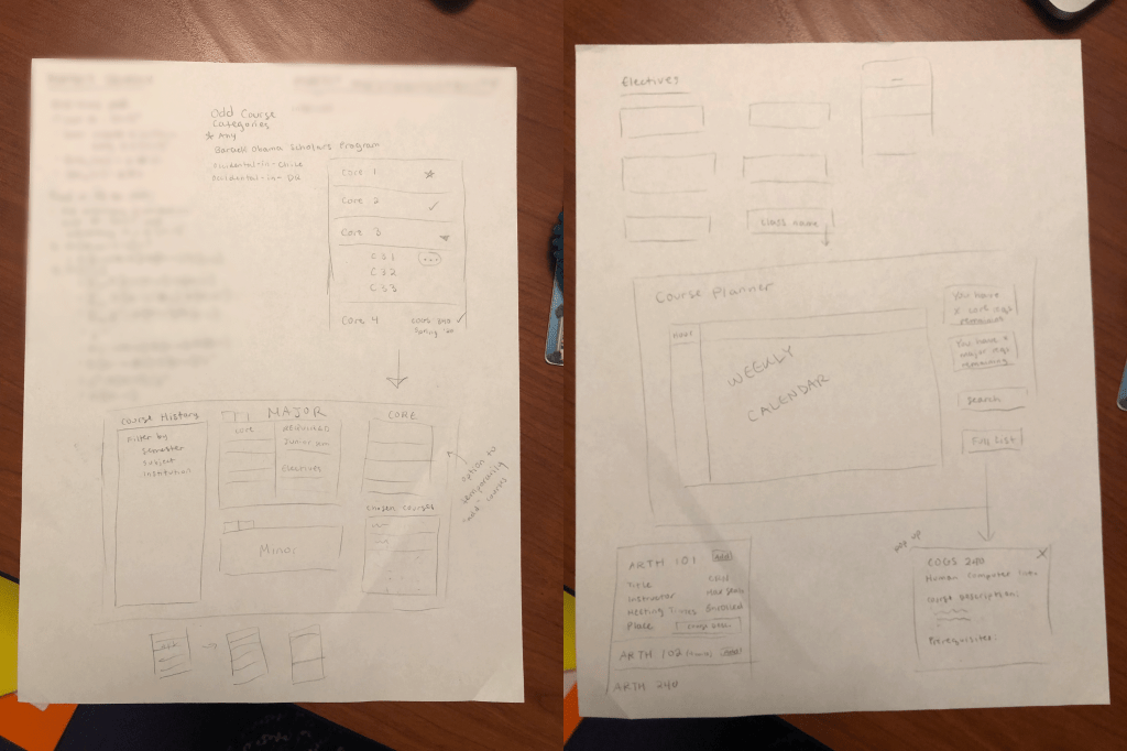
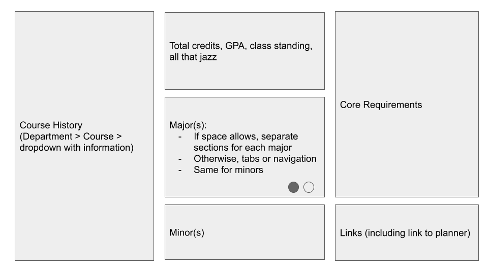
These were very basic layouts with minimal detail, essentially just a display of what information or features we wanted to include. However, just having these visualizations helped us get a better sense of what we wanted our designs to look like as well as an estimate of what we would be able to fit in a single page. For example, for our progress/records page, we wanted to make sure that the records for a second major/minor would also be accommodated for, thus the initial idea of having tabs rather than having them in a separate section. We also knew that one feature we wanted to have in our planner was a weekly calendar, so we made sure to allot a section of the page for that.
One concern at the time for both me and Sarah was the fear of being too ambitious. Both of us had mentioned our perpetual habit of unknowingly attempting to tackle a problem too big in the allotted time for projects. Fortunately, a meeting the following day with our professor and TA was able to slowly diminish these concerns. We had introduced our current ideas and presented the sketches of our layout. The idea we included about being able to use the records page as a temporary planner seemed to stand out and once the distinction between planning and purely showcasing records was established, the problems we were actually trying to resolve with our designs were made much clearer, allowing us to further specify the functions we want our pages to serve.
Concentrating and Improving Our Designs.
We decided to transfer our wireframes to Google Slides so that a) we would not have to continue erasing or redrawing ideas and b) we could easily backup previous iterations of our design by making duplicate slides.
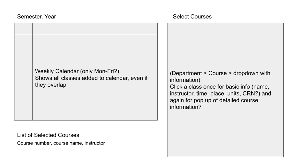
After the meeting previously mentioned, we ended up making our main priority the semester planner. To reiterate, our general idea with this planner was that students would be able to select courses that they plan to take in the upcoming semester to create a tentative schedule that would show up both as a list and on a calendar with respective timeslots dedicated to each course. To go beyond simple wireframes, we began to setup specific aspects of our pages one by one which I will break down below.
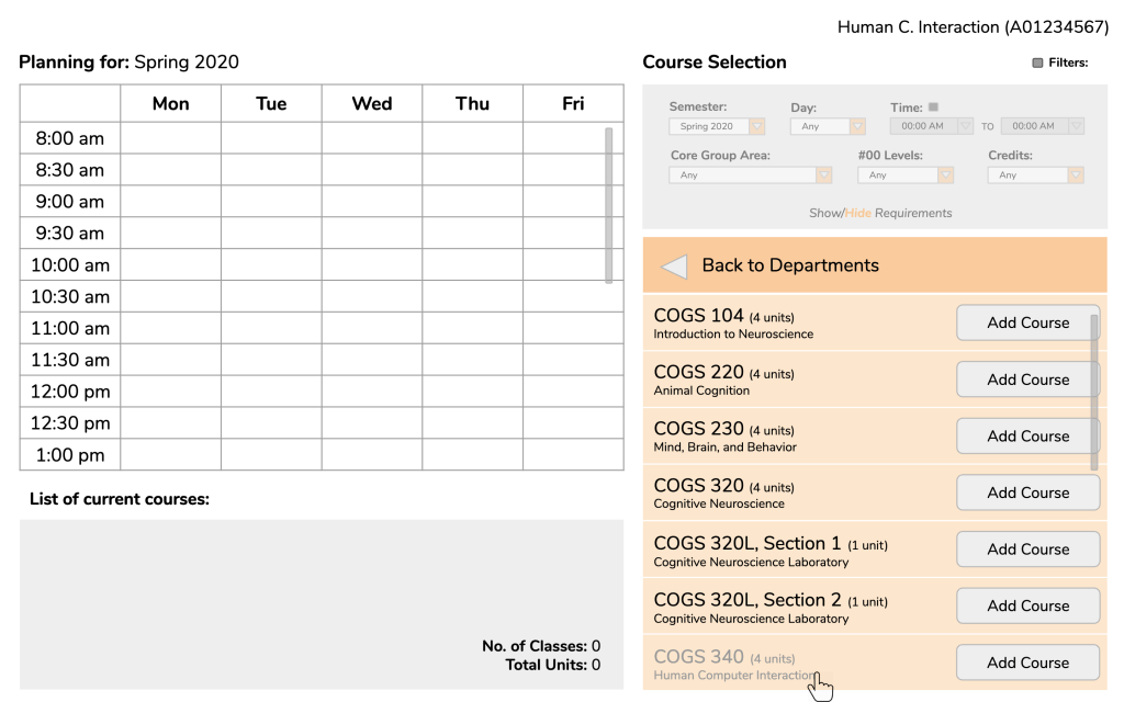
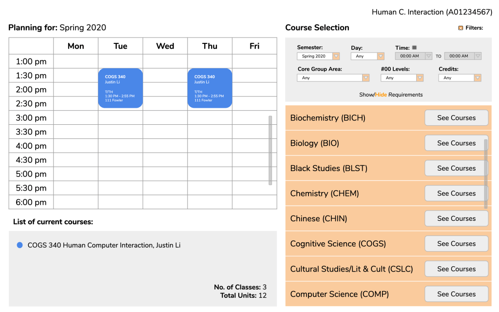
Course Selection.
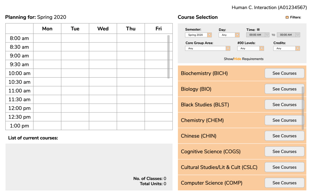
We wanted to figure out a method of course selection that would fit neatly and tightly into our page while still holding all of the information that Course Counts would give us including course description and requisites.
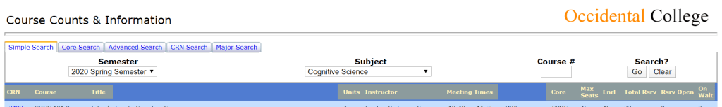
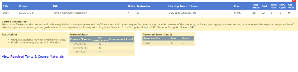
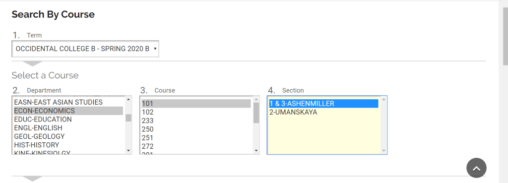
In our initial stage of planning, one idea that crossed our minds was the page to buy/rent textbooks by courses on Oxy’s bookstore website. When searching by courses, you first select the term in interest. Then, in the Department section below, all of the departments are listed. When you select a department, a list of courses in that department appears in the box over, and in the same way, when you select a course, a selection of sections will appear in the final box.
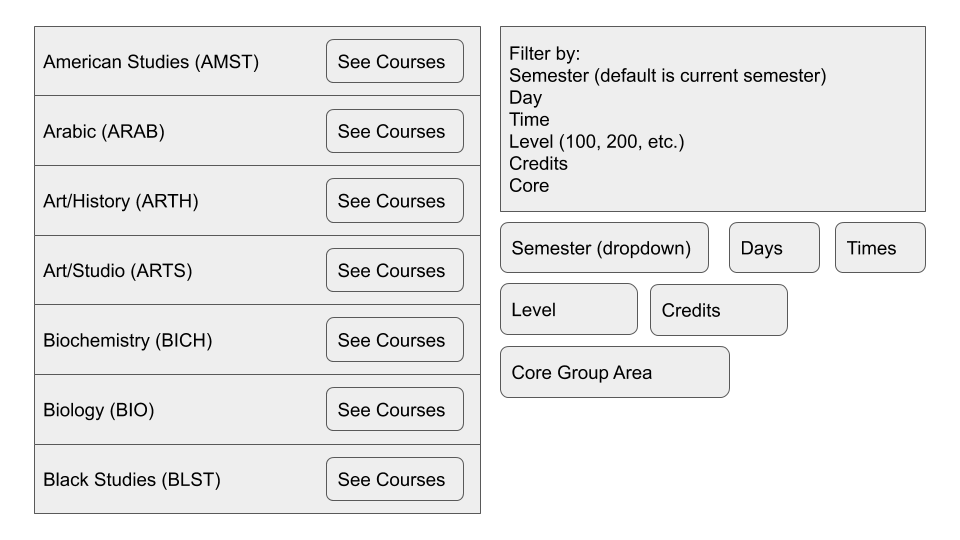
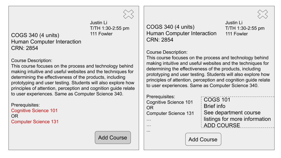
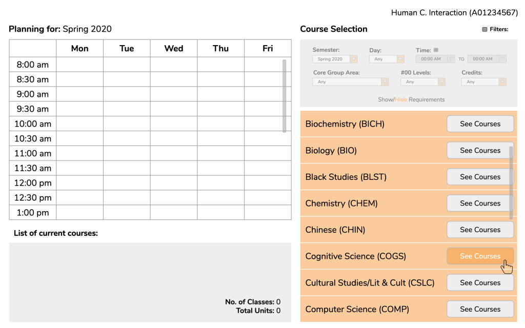
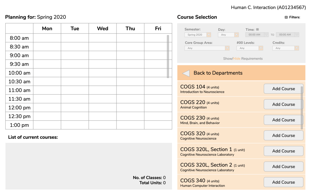
Using this method as inspiration, we constructed a basic format of course selection in which students would first select a department, which would then switch over to a list of courses in that department. Once the courses are listed, the user would either be able to add the desired course or click on the course for brief information. Since a small dropdown box would only be able to contain so much information, we also considered the idea of having a link to more information that would prompt a popup to show up on the screen.

Calendar.
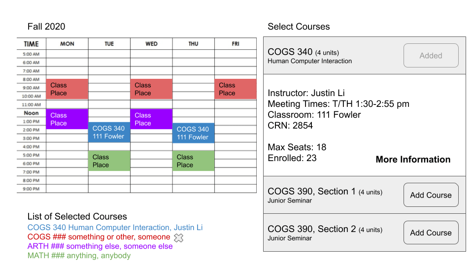
One of the essential aspects of our planner is the weekly calendar. Our belief was that having a calendar would help students better visualize where their classes would fall in their daily schedules rather than just having a list of timeslots. In addition, selected courses would be shown underneath the calendar with course color-coded to match the timeslot color above.
Graduation Requirements.
One aspect of the planner we went back and forth about was adding a section for tracking core and major requirements, minor if applicable. Having access to fulfilled requirements as well as requirements that still need to be fulfilled might guide a student in selecting appropriate courses. However, an issue or consideration that came up in one of our classes was this idea of cognitive load. We were worried that perhaps having too much information on the page at once would overwhelm a student, making us consider perhaps adding an option to view or hide this section as a user pleased (see final designs below).
User Testing and Finalizing Our Designs.
Once we were comfortable with the basic construction of our design, we created a separate slideshow to begin making cleaner versions of our design with all of the details we need. It was also these versions that we began to conduct user testing, specifically with Oxy students. My main goal with user testing was to see whether a student would be able to:
- Comfortably navigate our planner (i.e. are our signifiers clear?)
- And, depending on the step, be able to expect, even in the slightest, what would happen should a certain action be taken
While we unfortunately were unable to record our user testing sessions, below is one of my completed testing sessions with each of the respective slides I showed my user:
(If desired, click here to skip user testing session.)
Scenario: You are a sophomore Cognitive Science major planning your spring semester. The first class you are considering taking and want to add to the planner is “Human-Computer Interaction” under the cognitive science department.
Bolded and italicized: Questions or instructions given to tester.
Normal: Testers responses.
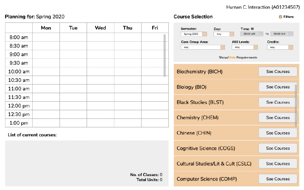
Frame 1: Given this page, how would you proceed?
I would first check the filters given above. But since the Cognitive Science department is already clear I would click on the “See Courses” button for Cognitive Science.
Frame 2: What would you expect to happen when you click?
I would hope that the list of classes shows up on the same page instead of on a different tab or even a link to a completely separate page.
Frame 3/4: Yes, our idea was that the list of courses would replace the list of departments. As you might see, you are given the option to add a course right away. However, you decide that you want to know more about the course before adding it to your planner. What do you think you would need to do in order to see more information?
I think I would be able to just click on the course and hopefully a description would be revealed. I’m guessing a description would open up underneath.
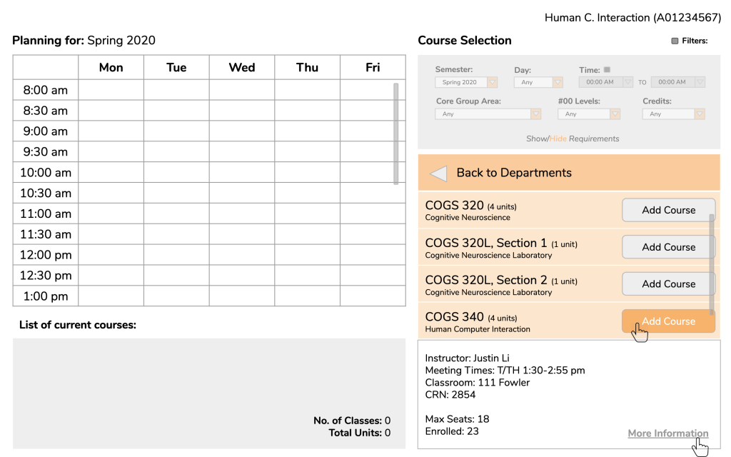
Frame 5/6: From here, you can either choose to add the course or see more information. If you decided to see more information, how would you proceed?
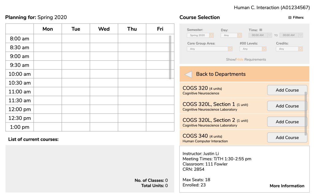
I would click on “More Information” (important to note that user believes the text is clickable.)
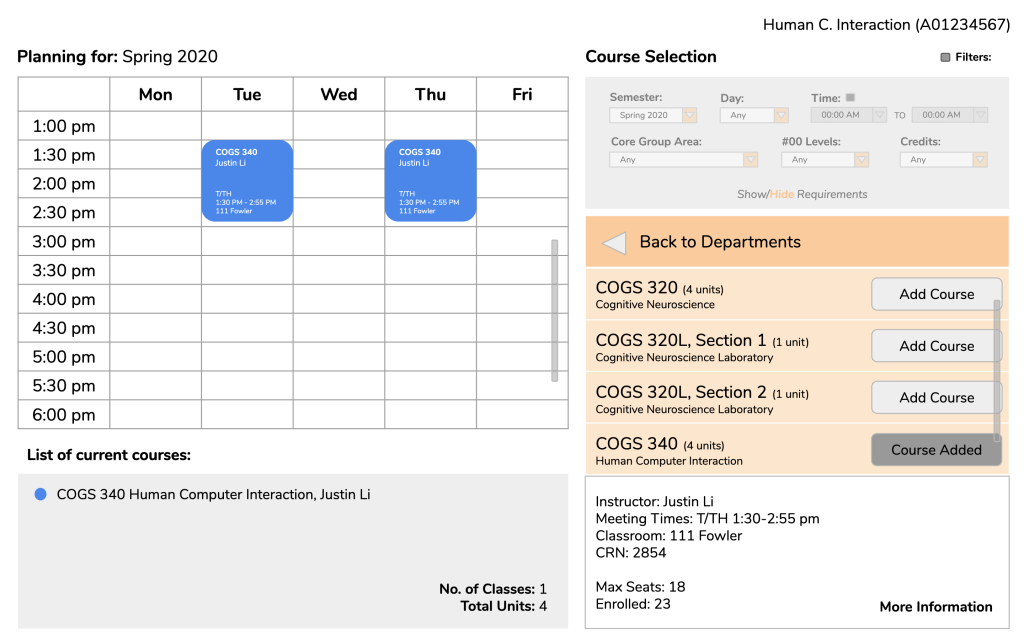
Frame 7/8: When you click on “More Information” a popup appears with the full course description as well as a button to add the course. *shows the user Slide 6 again* When you add the course, what elements of the screen do you think would change?
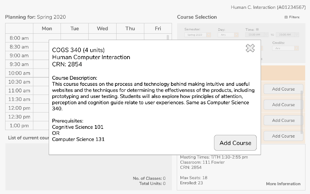
Well, first I would assume the calendar would update with timeslots with the respective course description. Then, I assume the course would be listed in the “List of current courses” section and the “No. of classes” and “Total units” would update correspondingly.
Frame 9: So, this is how the updated page would look. Like you said, the calendar updates and the “List of current courses” section updates with the appropriate changes. Another change is that the “Add Course” button is changed to be unclickable with the label “Course Added”.
Oh yeah, that’s definitely important.
Other comments by user tester after run-through:
- Questioned the placement of calendar. Noted that people (at least in America) tend to operate in a left-to-right fashion, so she wondered if it would be more intuitive to put the course selection on the right and the calendar on the left.
- Also mentioned a potential search option for classes, thought quickly noted afterward that perhaps that might not necessarily be needed for Oxy since the relatively small number of classes.
Complete Walkthrough of Scenario.
Here is a complete walkthrough of the user testing scenario:
The other testing sessions that I conducted went in a similar fashion. In an initial session, some features needed clarification such as what “Levels” in the filter session indicated and how courses would be deleted leading to changing the label to “#00 Levels” and making the signifier for deleting classes more distinct. In general, user testers reported that the planner was simple and basic but overall intuitive.
Although we ended up keeping the course selection to the right of the calendar, with other small revisions made, these were our final results:
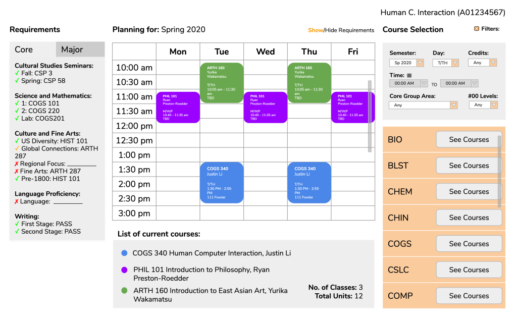
Green check – completed, Yellow check – in progress, Red X – incomplete.
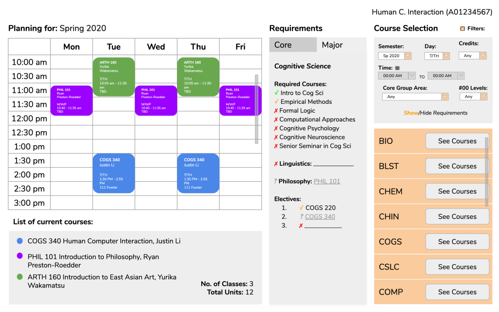
Courses in requirements with ? to indicate which requirements selected courses would fulfill.
Conclusions.
Looking back there are definitely some considerations of the planner that we ignored or missed completely as well as some flaws gone unnoticed. For example, we did not consider whether users should be allowed to add multiple classes in the same timeslot to keep track of backup classes. We also did not include in the full course description anything about reserved seats, another essential consideration a student must know while choosing classes. Given the time, I would have also put a little more consideration into the aesthetics of our pages as right now the design and colors are fairly flat and basic.
I will say this project has definitely made me more attentive to design. Recently, I participated in user testing for a friend outside of Oxy regarding a website for her school and found that some text that appeared to be links (blue and, when hovered over, underlined) were not actually links. Things like this began to catch my eye after our own progress of designing a website.
Overall, while we did hit some blocks, I found this project to be an interesting and good learning experience. It helped me gain some insight into the importance of good web design elements, and actually being able to experience the satisfaction of seeing a project come together gave me incentive to complete not just this project, but hopefully future projects as well, than just being for an assignment.
